
Articles
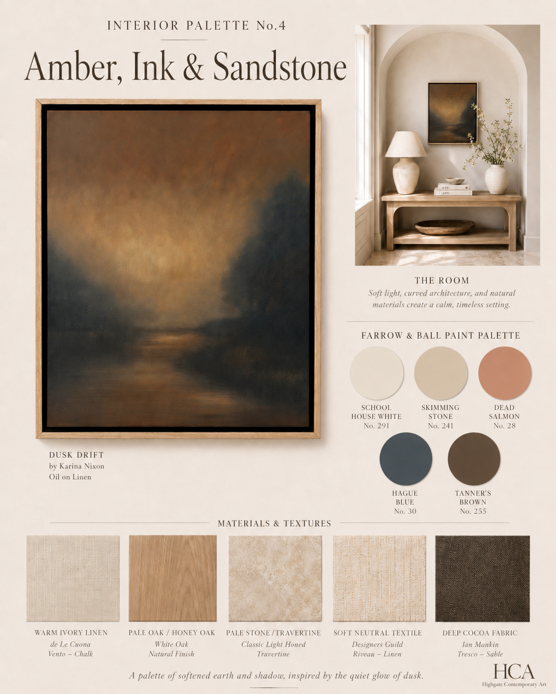
Interior Palette No.4: Amber, Ink & Sandstone
Interior Palette No.4 begins with Dusk Drift by Karina Nixon, a small but atmospheric painting filled with amber light, inky shadow and softened earth tones. Using a palette of Farrow & Ball colours including School House White, Skimming Stone, Dead Salmon, Hague Blue and Tanner’s Brown, this scheme explores how art can shape a room’s entire mood. Natural wood, warm stone, ivory linen and deeper cocoa textures create a calm, intimate interior where the painting becomes the quiet centre of the space.
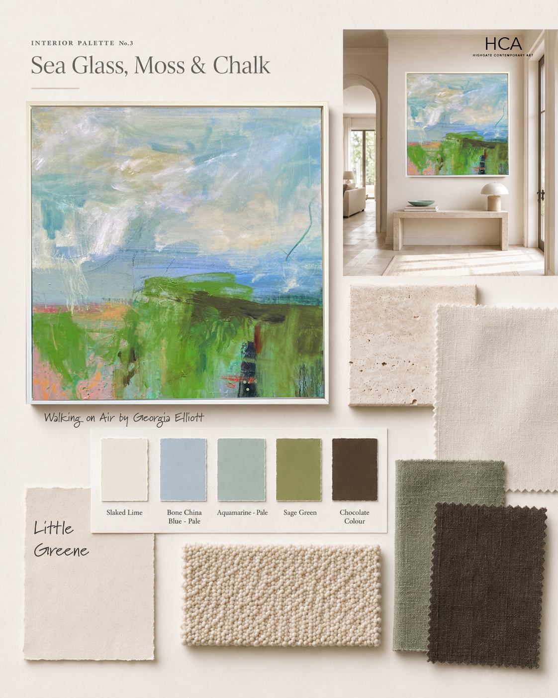
Interior Palette No.3: Sea Glass, Moss & Chalk
Sea Glass, Moss & Chalk begins with a painting full of light, movement and fresh, natural colour. Soft blues and aquamarine tones open the scheme, while moss green and deeper chocolate notes bring it back to earth.
Using Little Greene shades including Slaked Lime, Bone China Blue Pale, Aquamarine Pale, Sage Green and Chocolate Colour, this palette explores how a work of art can shape an interior without overwhelming it. Chalky walls, pale stone, woven textures and darker linen accents create a calm, contemporary setting where colour feels considered, organic and quietly uplifting.
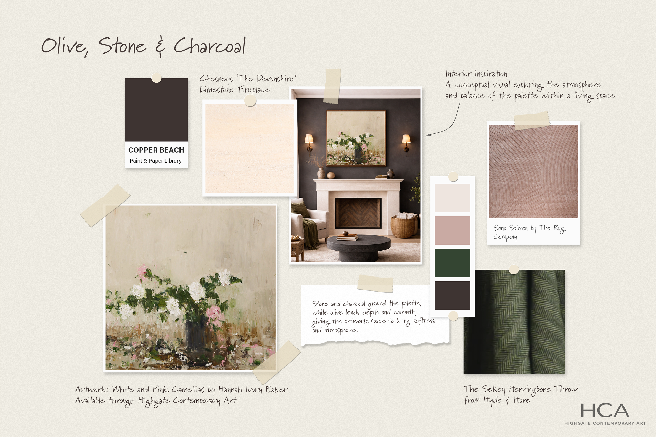
The Interior Palette No.2: Olive, Stone & Charcoal
Olive, Stone and Charcoal is a layered interior palette pairing White and Pink Camellias with rich wall colour, limestone, soft blush tones and olive accents.
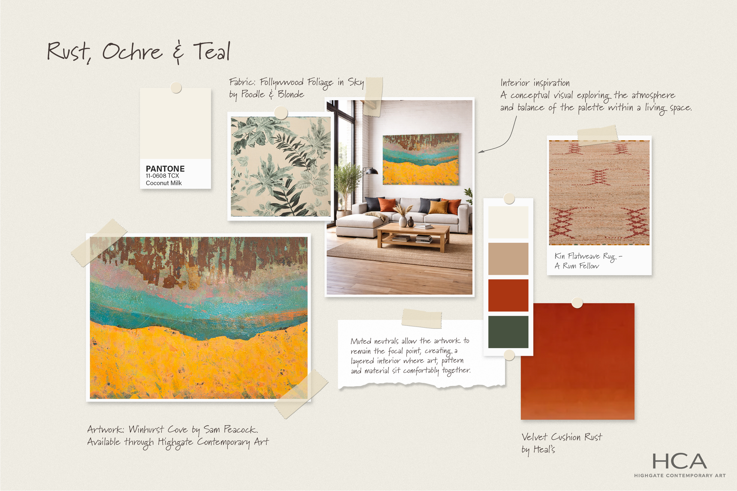
The Interior Palette No.1: Rust, Ochre & Teal
A new journal series exploring how a single artwork can shape the atmosphere of a room. In this first edition of The Interior Palette, Winhurst Cove by Sam Peacock sets the tone for a scheme of rust, ochre and teal, layered through texture, pattern and material