
Interior Palette No.3: Sea Glass, Moss & Chalk
There is a particular kind of painting that seems to bring the outdoors in without describing it too literally. It does not need a fixed horizon, a named view, or a recognisable place. Instead, it works through atmosphere: colour, movement, light and the feeling of standing somewhere open, where sky and land seem to blur into one another.
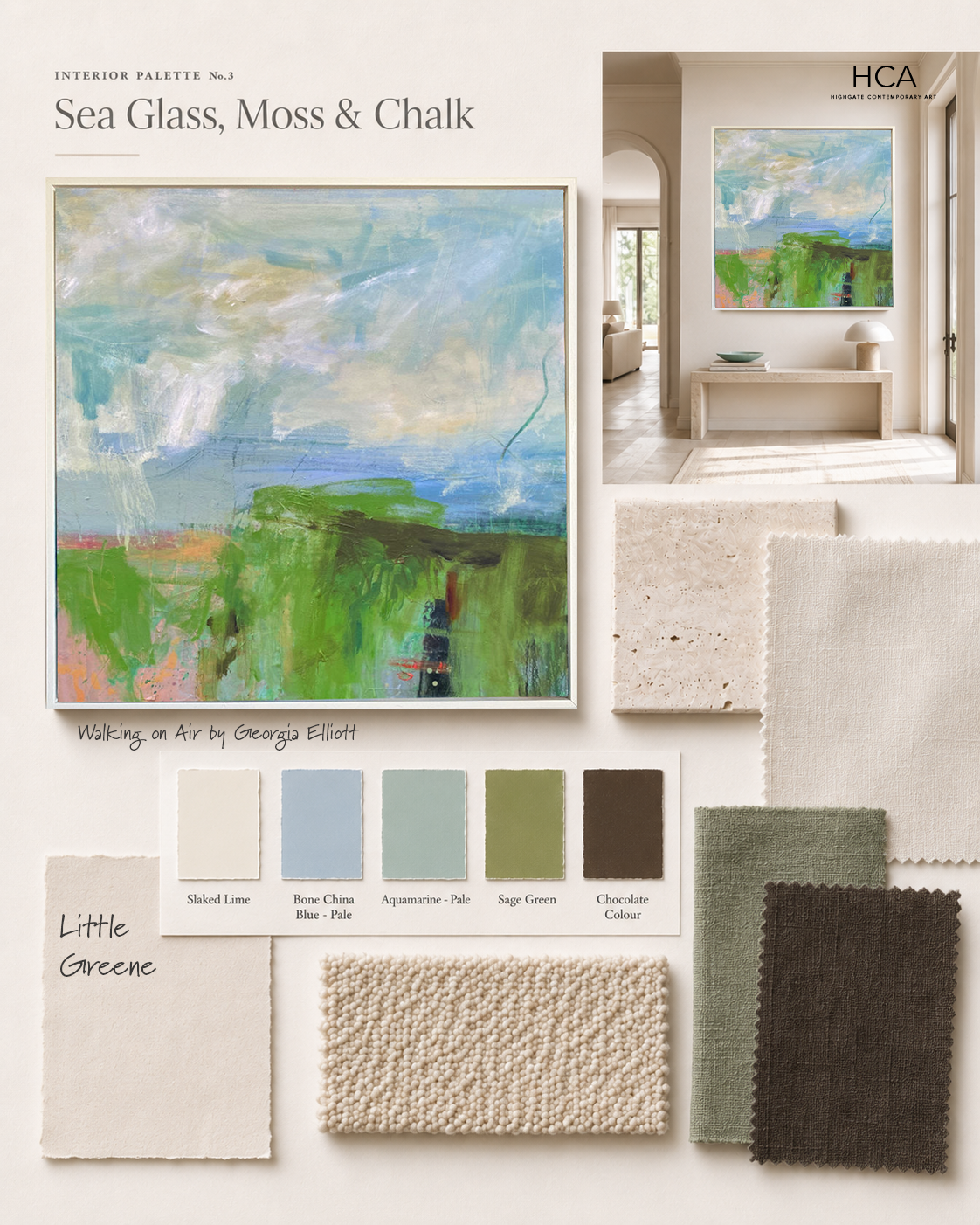
For this Interior Palette, the inspiration begins with Walking on Air by Georgia Elliott a painting full of fresh sky blues, soft chalky whites, bright moss greens and subtle earthy undertones. It has a wonderful sense of air and growth. There are passages that feel almost coastal, with sea glass blues and misted light, while the lower sections hold a more grounded, garden like energy, rich with green, peat and flashes of warmth.
The result is a palette that feels bright, natural and optimistic, but still refined enough for a calm contemporary interior.
The Palette
Chalk - Slaked Lime
A soft, warm white forms the foundation of the scheme. Rather than a stark gallery white, this is gentler and more liveable, allowing the artwork’s blues and greens to feel fresh without becoming cold.
Mist - Bone China Blue - Pale
A pale blue grey taken from the quieter sky tones in the painting. This shade works beautifully in textiles, upholstery, glass or painted joinery where a room needs a little softness and lift.
Sea Glass - Aquamarine - Pale
Cooler and clearer than sage, this blue green brings the sense of light moving through water. Used sparingly, it adds freshness without overwhelming the room.
Moss - Sage Green
The strongest note in the palette. Moss green gives the scheme its vitality and connects the painting back to the landscape. It would work well as a cushion, occasional chair, lampshade, ceramic piece or small painted detail.
Peat - Chocolate Colour
A deep earthy brown prevents the scheme from feeling too pretty. It gives the palette weight and works particularly well through timber, dark ceramics, aged bronze or a grounding piece of furniture.
*Paint colours from Little Greene
How to Use This Palette at Home
The beauty of this scheme is that it can sit within a very neutral interior while still bringing in colour. Start with a calm base of chalky walls, pale stone, linen and natural wood. These quiet materials give the painting room to breathe and allow its surface to become the focal point.
From there, pick up the colour accents gently. A sea glass vase, a moss green cushion, a mist blue throw or a small warm ceramic object can be enough to echo the painting without making the room feel overly matched. The key is not to replicate the artwork too literally, but to let it set the rhythm of the space.
In the room image, the painting sits above a pale console in a bright, architectural hallway. The surrounding materials are deliberately restrained: stone, soft plaster tones, textured rug, simple ceramics and natural branches. This keeps the overall feeling elegant and open, while the painting introduces the energy, colour and movement.
Materials That Work Beautifully With This Scheme
This palette suits natural, tactile materials particularly well. Think pale oak, limestone, travertine, boucle, slubby linen, textured wool and softly glazed ceramics. These surfaces have enough variation to sit comfortably alongside the painterly marks in the artwork.
A polished or overly glossy interior might make the painting feel less settled. Instead, materials with a slightly handmade or organic quality help reflect its layered surface. The brushwork, the visible movement and the shifts in tone all feel more at home when paired with materials that have their own texture and depth.
Why the Artwork Leads the Room
One of the most effective ways to build an interior scheme is to begin with a painting rather than treating art as the final decorative layer. A strong artwork already contains a palette, a mood and a sense of proportion. It can suggest whether a room should feel calm or energetic, open or intimate, minimal or richly layered.
Here, the painting offers both freshness and grounding. The blues open the space. The greens bring life. The chalky whites soften the overall composition. The darker earthy notes add structure. Together, they create a room that feels light filled but not insubstantial, contemporary but not cold.
The Overall Mood
Sea Glass, Moss & Chalk is a palette for rooms that want to feel calm, natural and quietly uplifting. It suits bright hallways, relaxed living spaces, bedrooms, garden rooms and dining areas where a sense of light and ease is important.
It is fresh without being sharp, colourful without being loud, and neutral enough to work in a refined contemporary home. Most importantly, it allows the artwork to do what good paintings do best: change the atmosphere of a room.
View Walking on Air by Georgia Elliott →
Browse paintings that work within this palette →
Looking for art to suit a similar scheme?
Request tailored suggestions →