
Interior Palette No.4: Amber, Ink & Sandstone
There are some paintings that do not simply sit within a room. They change the atmosphere of it.
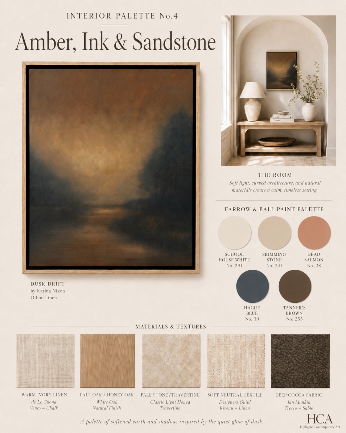
Dusk Drift by Karina Nixon has that particular quality. A softened landscape of amber light, inky shadow and deep, still water, it draws the eye slowly inward. The painting feels both intimate and expansive, as though seen at the edge of evening when the last warmth of the day begins to dissolve into darkness.
For this Interior Palette, the painting becomes the starting point for a room built around warmth, depth and natural texture. Rather than lifting the colours too literally, the scheme draws from the feeling of the work: muted glow, softened earth, shadowed blue and the quiet elegance of stone.
The Palette
Amber, Ink & Sandstone is a palette of contrast, but not harsh contrast. It balances warmth and shadow, softness and structure, light and depth.
The Farrow & Ball colours chosen for this scheme are:
School House White No. 291
A soft, warm off white that gives the room a gentle base. It works beautifully on walls where you want warmth without creaminess, allowing the painting to hold the focus.
Skimming Stone No. 241
A warm stone neutral that brings a quiet architectural quality to the scheme. It echoes the plaster, stone and natural surfaces in the room and gives the palette its calm foundation.
Dead Salmon No. 28
A muted, aged pink with earthy warmth. Used sparingly, it can pick up the amber and dusky rose tones within the painting without making the room feel overly coloured.
Hague Blue No. 30
A deep, inky blue that reflects the darker passages of the work. It gives the palette drama and depth, particularly when used in smaller accents such as a cushion, a painted side table, a lampshade or a piece of joinery.
Tanner’s Brown No. 255
A rich, dark brown that grounds the scheme. Softer than black, it brings out the shadow in the painting while still feeling warm and natural.
The Room
The room image is intentionally soft and architectural. A curved alcove, pale walls, natural wood and warm stone create a calm setting for the painting. The artwork is modest in scale, but the space around it gives it presence. This is often one of the most effective ways to hang a smaller work: allow it room to breathe.
At 50 x 40cm, Dusk Drift does not need to dominate a wall. It works beautifully when placed above a console, within an alcove, beside a lamp, or as part of a more intimate corner of a home. The surrounding materials should support the atmosphere of the painting rather than compete with it.
Here, pale oak, soft linen, stone and warm ceramics create a sense of quiet luxury. The deeper colours are used as accents rather than large blocks, allowing the painting to remain the emotional centre of the space.
Materials and Textures
This palette suits natural materials with a soft, tactile quality.
Warm ivory linen, pale oak, honey toned wood and light travertine give the scheme its ease. These are balanced with deeper cocoa fabric, dark woven texture and inky blue accents, which stop the room from becoming too pale or decorative.
Suggested fabric and material references include:
Warm ivory linen
de Le Cuona, Vento in Chalk
Pale oak or honey oak
White oak in a natural finish
Pale stone or travertine
Classic light honed travertine
Soft neutral textile
Designers Guild, Riveau in Linen
Deep cocoa fabric
Ian Mankin, Tresco in Sable
The combination is soft, layered and quietly atmospheric. Nothing is too polished. Nothing is too stark. The materials have enough texture to sit comfortably beside the painting’s surface and enough restraint to let the work lead.
How to Use This Palette at Home
Begin with the lightest tones. Use School House White or Skimming Stone on walls to create a warm, understated base. Add pale oak, stone, linen and ceramic pieces to keep the room natural and calm.
Then introduce depth through small but deliberate accents. A dark linen cushion, an inky blue lampshade, a deep brown bowl, a charcoal framed mirror or a darker textile can all echo the painting’s shadowed areas.
Dead Salmon works best as a subtle warmth rather than a dominant colour. It might appear in a small cushion, a lampshade lining, a ceramic glaze, or even in flowers placed nearby. It brings out the painting’s duskier tones and keeps the scheme from feeling too neutral.
The key is restraint. This palette is not about matching every colour in the painting. It is about allowing the painting to set the mood of the room.
Why It Works
The strength of Amber, Ink & Sandstone lies in the balance between warmth and stillness.
The amber tones bring a soft glow. The ink tones add atmosphere. The sandstone neutrals make the palette liveable. Together, they create an interior that feels calm, composed and deeply inviting.
This is the beauty of beginning with art. A painting already contains a mood, a palette and a sense of movement. When the rest of the room responds to it, the interior feels more considered and more personal.
Dusk Drift by Karina Nixon brings a quiet intensity to this scheme. It is a small work, but one with remarkable depth. In the right setting, it becomes not just a painting on a wall, but the beginning of the room’s entire atmosphere.