
The Interior Palette No.2: Olive, Stone & Charcoal
Some palettes are built around contrast, others around softness. Olive, stone and charcoal sits somewhere between the two, balancing depth with warmth and structure with a more organic sense of ease.
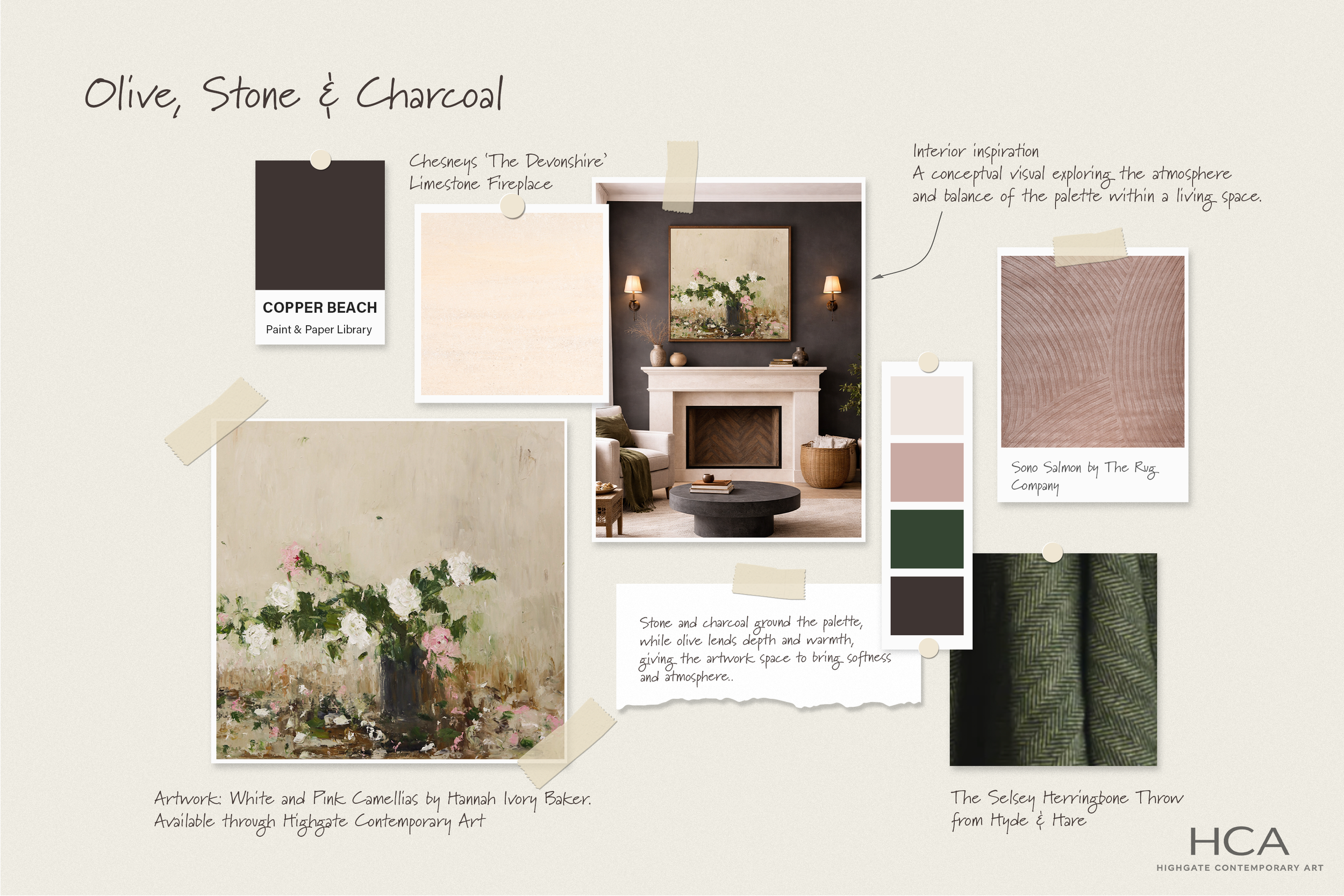
Olive, Stone & Charcoal A palette of softness, depth and contrast that explores how artwork, material and colour can come together in a layered, grounded living space.
At the centre of this palette is White and Pink Camellias by Hannah Ivory Baker, a painting whose gentle whites, layered greens and touches of blush pink set the tone for the scheme as a whole. Its softness is what makes the darker elements work, allowing richer colours and weightier materials to feel considered rather than overpowering.
View White and Pink Camellias →
The depth of the palette comes through Copper Beach by Paint & Paper Library, a dark, earthy tone that brings intimacy and definition to the room. Used on the walls, it creates a backdrop that allows the painting to hold focus while giving the softer tones within the artwork greater clarity. Against it, the pale stone of Chesneys' The Devonshire limestone fireplace introduces lightness and balance, keeping the overall feel lifted and refined.
Texture plays an important role here too. The soft blush tone of the Sono Salmon rug byThe Rug Company adds a subtle warmth that echoes the palest pinks in the painting, while also softening the stronger contrast between stone and charcoal. Alongside it, the The Selsey Herringbone Throw from Hyde & Hare introduces a richer, more grounded note, drawing out the foliage within the artwork and adding another layer of depth to the scheme.
A palette of softness, depth and contrast, Olive, Stone and Charcoal is designed to feel layered, grounded and effortlessly lived with. Each element brings something different to the room, from the dark cocooning wall colour to the softness of limestone, the muted warmth of blush and the earthy richness of olive.
As with each Interior Palette, this is a conceptual composition intended to explore how art, material and colour can work together within a living space. Here, the balance comes from letting the artwork lead, with the surrounding palette chosen to enhance its atmosphere and draw its colours gently out into the room.
View White and Pink Camellias by Hannah Ivory Baker →
Inspired by this palette?
Explore the painting that shaped it, or discover other works with a similar sense of warmth, depth and atmosphere.
Browse works in this palette →
Looking for art to suit a similar scheme?
Request tailored suggestions →