
The New Neutrals: How Calm Spaces Are Evolving for 2026 (And Why Art Matters More Than Ever)
At Dusk the Sea Waited by Hannah Ivory Baker
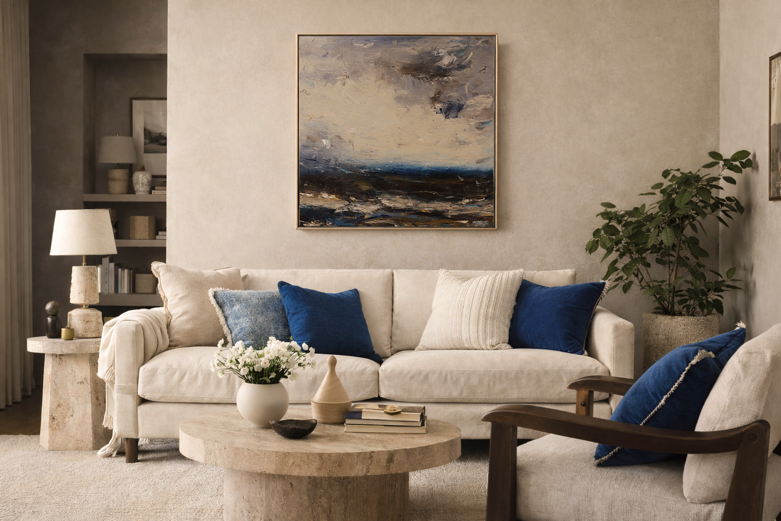
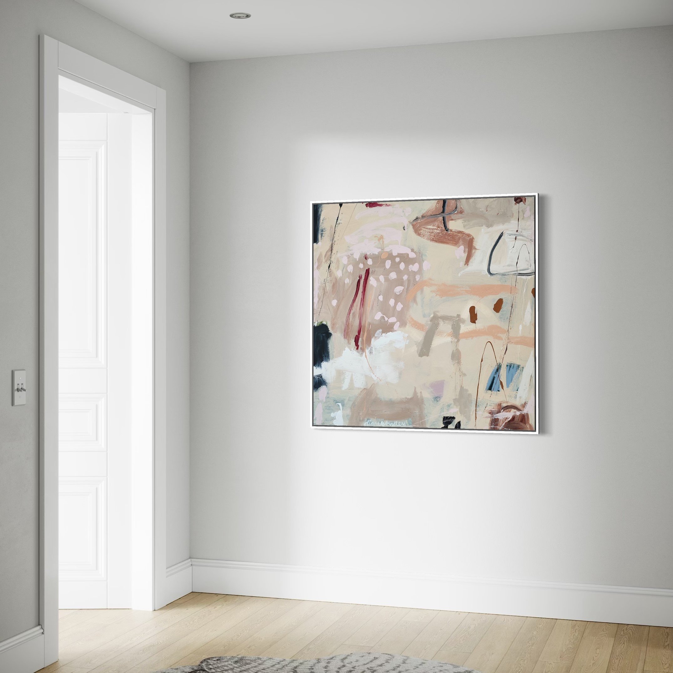
Calm is changing. “Neutral” used to mean crisp white walls, cool grey sofas, and a minimal look that photographed well but didn’t always feel lived-in. The shift we’re seeing for 2026 is different: calm interiors are becoming warmer, more tactile, and quietly expressive, designed for the nervous system as much as the eye.
This is the heart of our Calm & Neutral Spaces collection: artwork chosen for rooms that want stillness without sterility, and softness without blandness.
1)Warm neutrals with depth (goodbye flat white, goodbye icy grey)
Design forecasts for 2026 consistently point to warm, grounded neutrals, think sand, vanilla, clay, oatmeal, and soft stone, rather than high-contrast monochrome or blue-cast greys.
Why it works:
Warm neutrals behave like natural light: they’re forgiving, they flatter skin tones, and they make art feel intentional rather than “added later”.
Our go-to neutral “families” for Calm & Neutral Spaces:
Chalk + Linen: off-white, bone, calico, warm putty
Sand + Clay: beige, almond, soft terracotta-beige, biscuit
Stone + Mushroom: taupe, mushroom, greige (warm-leaning), pebble
Woodsmoke: gentle fawn and deeper smoke tones (for grounding and contrast)
2) Texture is the new pattern
If colour is staying quiet, texture is doing the talking. One of the most repeated 2026 notes is the return of hand-finished surfaces: limewash, plaster, microcement, softly mottled walls, finishes that create movement without shouting.
How to bring this in (without a renovation):
Limewash-style paint finishes in feature areas (hallways, stair walls, behind the sofa)
Natural textiles: linen, wool, bouclé, cotton matelassé
Matte ceramics, travertine accessories, woven storage
Layered rugs (flatweave + small plush accent)
Why it matters for art:
Highly textured rooms make flat “decor prints” look even flatter. In a textured space, original work (or beautifully produced limited editions) holds its own because it has presence.
3) Trend: Biophilic calm. Nature, but refined
Biophilic design continues to shape calmer interiors through natural materials, organic forms, and earthy palettes.
This doesn’t have to mean a jungle of plants. In 2026, it’s more curated:
One architectural plant instead of many small ones
Wood with visible grain (oak, walnut, ash)
Stone and clay accents
A palette that echoes nature: soft greens, flax, driftwood, chalk
Art pairing tip:
If your room is already “natural”, choose art that is nature-referencing but contemporary, abstracted florals, coastal light, atmospheric landscapes, gestural marks, so it feels elevated rather than themed.
4) Trend: Quiet luxury… plus personality (in small doses)
“Quiet luxury” doesn’t disappear, it simply matures. Designers are keeping the restraint, but bringing in more character, history, and individual taste, rather than one-size-fits-all minimalism.
In calm spaces, personality often arrives via:
A single piece of statement art
A sculptural chair or curved silhouette
A darker wood tone for contrast
A moody accent colour used sparingly
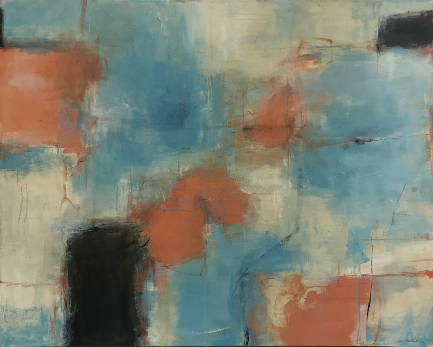
5) The “calm accent” colours of 2026: blues and deep naturals
While this journal category is Calm & Neutral, it’s worth noting what’s happening around it: several 2026 colour narratives lean into blue tones for serenity, often paired with warm neutrals so the overall feeling stays soft and grounded.
And alongside that, we’re also seeing richer, deeper luxury palettes emerge, not to replace neutrals, but to add depth when you want a more enveloping calm.
How to use this without losing the “calm”:
Keep the room neutral; let the accent live in one place (a niche, a single wall, a velvet cushion, a lamp shade)
Choose accents that feel natural: inky denim, slate, moss, espresso, charcoal
Repeat the accent twice (e.g., one cushion + one vase) so it looks intentional
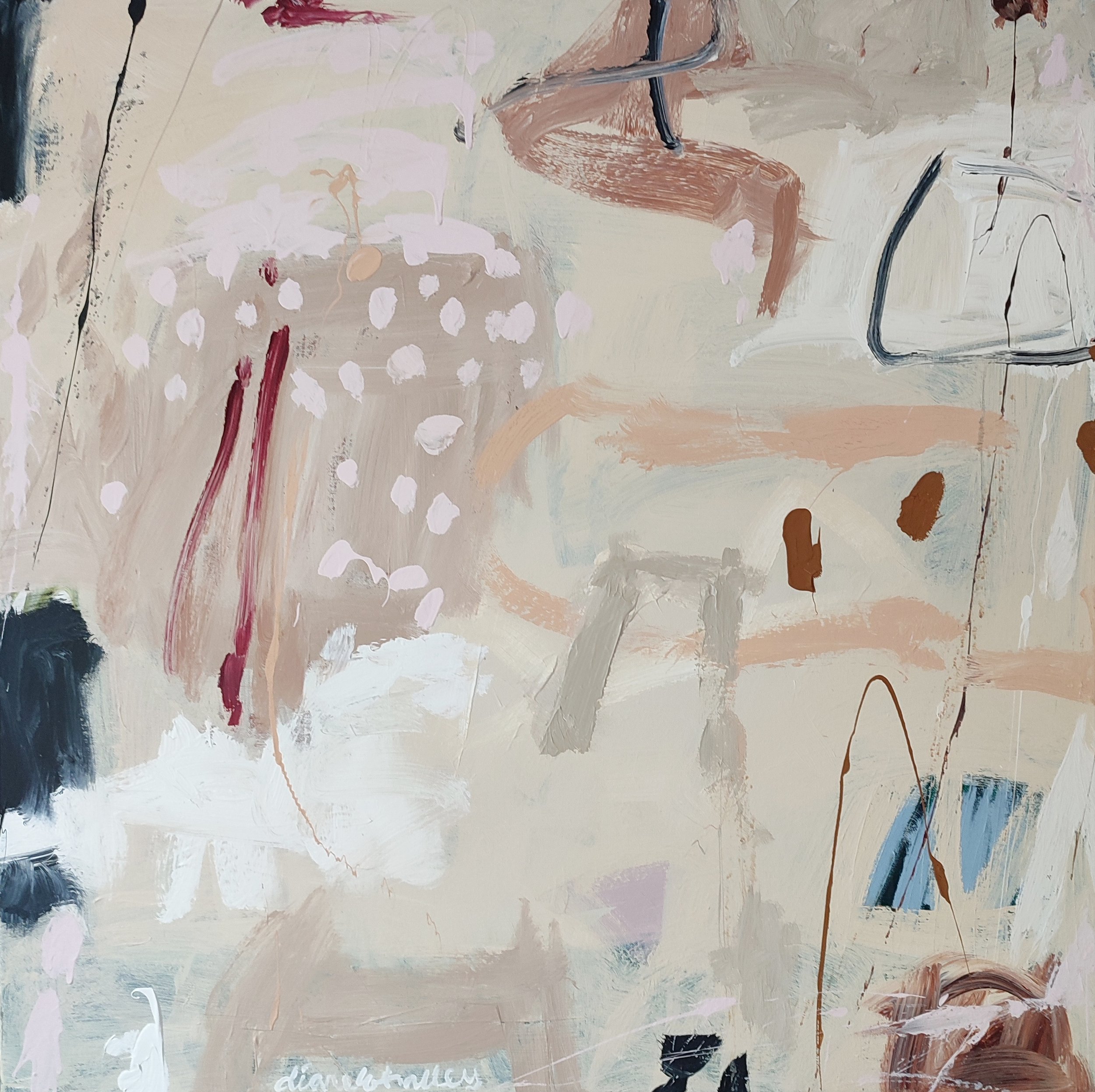
Pool Garden by Diane Whalley
6) The Calm & Neutral palette guide (designer-style, practical)
Here are three palette “recipes” that work beautifully with contemporary art.
Palette A: “Gallery Soft” (bright calm)
Warm off-white walls (chalk / bone / calico)
Pale oak or light walnut
Textiles: linen, cotton, boucle in oat + stone
Metals: brushed nickel or aged brass (not shiny chrome)
Artwork direction: tonal abstracts, soft coastal light, neutral florals with gentle contrast.
Palette B: “Stone + Shadow” (more depth, still calm)
Mushroom / putty walls
Darker wood (walnut, smoked oak)
Textiles: wool + woven textures, soft charcoal accents
Artwork direction: atmospheric landscapes, charcoal-line work, pieces with a strong focal mark.
Palette C: “Warm Minimal” (calm with modern edge)
Sandy beige walls
Travertine / pale stone accents
Black used sparingly (frames, a single side table)
Artwork direction: works with negative space, confident composition, contemporary still life.
7) How to choose art for neutral interiors (so it doesn’t disappear)
Neutral rooms can do two things to art:
Make it look expensive and intentional
Or make it look lost and decorative
Use this quick checklist:
Choose one “hero” quality
Scale (large, confident)
Contrast (light vs dark)
Texture (visible surface, layering)
Colour moment (one restrained colour note)
Then support it with restraint
Simple framing (or no frame if the work suits it)
Fewer competing objects around it
Thoughtful lighting (a picture light or angled spotlight if possible)
8) Styling rules that make calm rooms feel curated (not bland)
Rule of three textures: one soft (linen), one structured (wood), one mineral (stone/ceramic/plaster).
Echo your undertone: if your walls are warm, keep your whites creamy, not icy.
Let negative space breathe: calm is created by what you don’t fill.
Use contrast intentionally: one darker anchor (frame, console, lamp) stops neutrals feeling floaty.
Bring it home: Calm spaces deserve artwork with presence
A calm room is not an empty room. It’s a room where every element earns its place, and art is often the most personal element of all.
Explore Calm & Neutral Spaces to find pieces that bring tonal harmony, gentle contrast, texture and depth, and a sense of quiet focus.
Browse the Calm & Neutral Spaces collection →
Need help choosing a piece for your room? Send us a photo of your space and we’ll recommend options for scale, palette and placement.
Get in touch
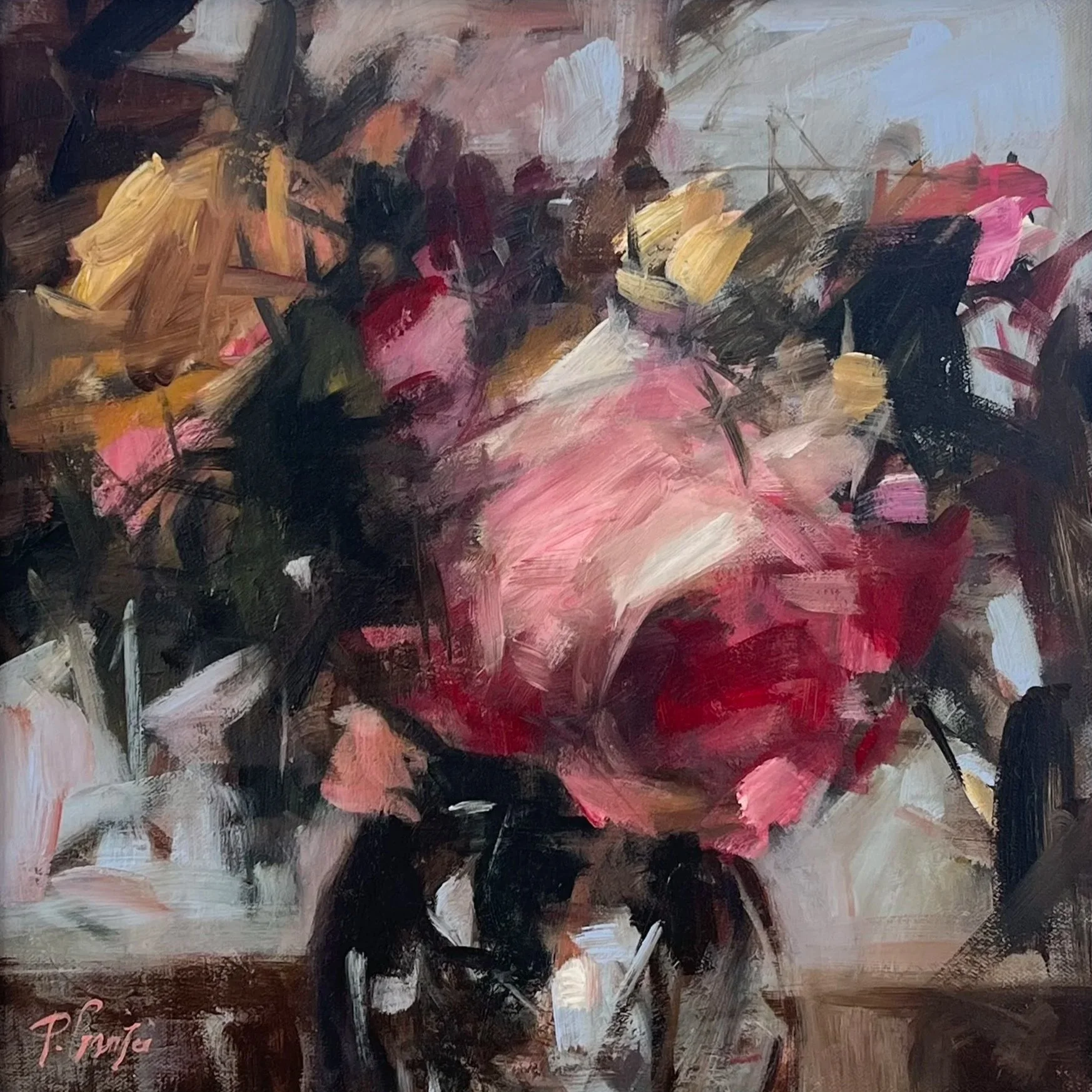
oil & mixed media on canvas
60 × 70 cm - artwork
framed 62 × 72 cm (ash frame)
signed and titled on reverse
by Laura Menzies